ShopDreamUp AI ArtDreamUp

Deviation Actions

![[JAEJOONG] - Mike and Red Soundwaves](https://images-wixmp-ed30a86b8c4ca887773594c2.wixmp.com/f/6a3c9036-360b-4a9a-8157-55bd98a50a70/d93ysry-d88c8ac2-94a2-47ea-9fa3-8391ed210864.jpg/v1/crop/w_92,h_92,x_0,y_14,scl_0.029553485383874,q_70,strp/_jaejoong_____mike_and_red_soundwaves_by_idnidveifencetum_d93ysry-92s.jpg?token=eyJ0eXAiOiJKV1QiLCJhbGciOiJIUzI1NiJ9.eyJzdWIiOiJ1cm46YXBwOjdlMGQxODg5ODIyNjQzNzNhNWYwZDQxNWVhMGQyNmUwIiwiaXNzIjoidXJuOmFwcDo3ZTBkMTg4OTgyMjY0MzczYTVmMGQ0MTVlYTBkMjZlMCIsIm9iaiI6W1t7InBhdGgiOiJcL2ZcLzZhM2M5MDM2LTM2MGItNGE5YS04MTU3LTU1YmQ5OGE1MGE3MFwvZDkzeXNyeS1kODhjOGFjMi05NGEyLTQ3ZWEtOWZhMy04MzkxZWQyMTA4NjQuanBnIiwiaGVpZ2h0IjoiPD0yNTcwIiwid2lkdGgiOiI8PTE2MDAifV1dLCJhdWQiOlsidXJuOnNlcnZpY2U6aW1hZ2Uud2F0ZXJtYXJrIl0sIndtayI6eyJwYXRoIjoiXC93bVwvNmEzYzkwMzYtMzYwYi00YTlhLTgxNTctNTViZDk4YTUwYTcwXC9pZG5pZHZlaWZlbmNldHVtLTQucG5nIiwib3BhY2l0eSI6OTUsInByb3BvcnRpb25zIjowLjQ1LCJncmF2aXR5IjoiY2VudGVyIn19.J91vdJxLwzkg92_1W2Q8EMpFSwKbwH1aqAz4GDytfSk)


Suggested Deviants


Suggested Collections


You Might Like…


Featured in Groups


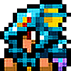
Description
That's it, guys. My art has been degrading ever since school started.
Here are just some quick facts supporting the reality written above:
-There is some toothpaste on this.
-It's the opposite of what I've expected. The blue stuff were put in excess so it was messed up by now. I only intended a bit of the blue stuff but this is what happened. The original concept is the person there fading away
-Fineliner.....I don't know what happened. I did my darkest Fineliner strokes, but it didn't show too well...
( c ) The character and the whole thing belongs to me
Image size
2418x3428px 2.42 MB
Comments25
Join the community to add your comment. Already a deviant? Log In
The first thing I noticed about this deviation is the obscure potential of it's author. I like dark themed pictures, but this case has a lot of nightmarish potential.
There are a couple of things that need improvement though, but I think it's no big deal, because the potential to picture something good is there. Anatomical correctness just comes with time and training.
Therefore, it would be good for you to invest some time in reading about human proportions and train them. There are lots of good tutorials on deviant that allow you to know and understand the human body perfectly. The proportions aren't THAT off though. You just need some minor corrections on torso/legs proportion and adjust the head size to the shoulder width. More dynamic positions are also desirable, but this is just an extra in this specific case, because when presenting a character, it's not that important.
I also think I see some shading, but it's not very evident due to the dark ambiance. Maybe it's not a bad idea to reinforce this aspect a bit, even when drawing characters in the shade I guess. Try start by defining a light source, even if diffuse, so you know better where to shade <img src="e.deviantart.net/emoticons/s/s…" width="15" height="15" alt="
As for the background, I love the chaotic nature of it, specially on the top side of the picture. The central part may be the one I don't like as much, because if you went for the representation of an object on the background, I guess it should, once more, get a little bit more definition, even though it's supposed to look irrelevantly hidden by the shadow.
Don't over worry about not being drawing good lately, sometimes this is just because we need a tiny break or you aren't having the right inspiration lately. Try reading some manga of your favorite style for at least half an hour before drawing, and you'll probably get nice results!
Good luck with your art <img src="e.deviantart.net/emoticons/s/s…" width="15" height="15" alt="